Display FMM results on the Abanico plot
by Sebastian Kreutzer (November 3, 2023)
1 Scope
Occasionally, I receive e-mails with cries for help with R and, more
specifically, R 'Luminescence'. Usually, the questions are very
task-tailored and come with their datasets to reproduce the problem;
so there is nothing I can share. However, some questions address more general issues. Then, I always think it would be nice to write a tutorial about it, but I usually never do because this
is rather time-consuming. The latest request I received was slightly
different because this question was asked a few times, and the
answer is indeed very straightforward to give. So, let’s summarise it in a
little tutorial for future usage.
The assignment at hand is to analyse (single-grain OSL) data using the finite mixture model (FMM, cf. Galbraith and Roberts, 2012) and then visualise the results nicely in an Abanico plot (Dietze et al., 2016). Admittedly, what I will present in the following is already available to some extent in the supplement to Dietze et al. (2016). Still, it appears not many people were looking into it.
2 Data generation
For our purpose, it is easiest to generate the dataset we need to analyse ourselves. In reality, it will be a dataset measured in the luminescence laboratory using a single-grain attachment or a camera.
Our dataset will have three different dose components, each following a normal distribution. The individual uncertainties are also sampled from a normal distribution representing relative uncertainties.
## set random seed for reproducibility of this example
set.seed(1362023)

AGE <- c(rnorm(30, 30, 2), rnorm(30, 45, 5), rnorm(30, 50, 2))
AGE_X <- AGE * rnorm(90, 0.07, 0.02)

## combine to data.frame
df <- data.frame(AGE, AGE_X)

## show as KDE plot
Luminescence::plot_KDE(df)
3 Data analysis and plotting
Although we have just created the dataset, we now treat it as an unknown
and run the FMM analysis to identify the statistically most meaningful number of
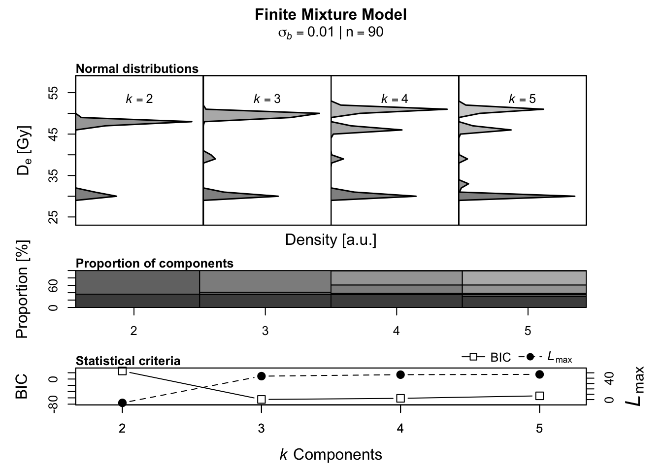
dose components in the dataset. Use the Luminescence::calc_FiniteMixture() this
can be done by letting the number of components free float between 2 and,
here arbitrarily selected, 5.
Luminescence::calc_FiniteMixture(
  data = df,
  sigmab = 0.01,
  n.components = 2:5)
##
## [calc_FiniteMixture]
##
## ----------- meta data ------------
## n: 90
## sigmab: 0.01
## number of components: 2-5
##
## -------- single component --------
## mu: 41.4464
## sigmab: 0.01
## llik: -520.449
## BIC: 1045.3979
##
## ----------- k components -----------
## 2 3 4 5
## c1_dose 30.43 30.38 30.38 30.05
## c1_se 0.34 0.35 0.35 0.66
## c1_prop 0.36 0.35 0.35 0.30
## c2_dose 47.81 39.43 39.02 32.64
## c2_se 0.36 0.95 0.93 2.94
## c2_prop 0.64 0.06 0.03 0.05
## c3_dose <NA> 49.57 46.23 39.10
## c3_se <NA> 0.45 1.27 0.89
## c3_prop <NA> 0.59 0.23 0.03
## c4_dose <NA> <NA> 50.86 46.22
## c4_se <NA> <NA> 0.71 1.27
## c4_prop <NA> <NA> 0.38 0.23
## c5_dose <NA> <NA> <NA> 50.86
## c5_se <NA> <NA> <NA> 0.71
## c5_prop <NA> <NA> <NA> 0.38
##
## ----------- statistical criteria -----------
## 2 3 4 5
## BIC 25.684 -65.047 -61.540 -53.577
## llik -6.092 43.773 46.519 47.038
##
## Lowest BIC score for k = 3
## No significant increase in maximum log likelihood estimates.
From the analysis, we can deduce that the most meaningful number of components
of our “unknown” dataset is 3. Every additional component is statistically
not justified. After this initial inspection of the data, we rerun the
analysis with the number of components fixed to 3 and the
output stored in an object called FMM, which will come in handy for the plotting.
I use the option verbose = FALSE here to suppress the terminal output,
which is not required here.
FMM <- Luminescence::calc_FiniteMixture(
  data = df,
  sigmab = 0.01,
  n.components = 3,
  verbose = FALSE)
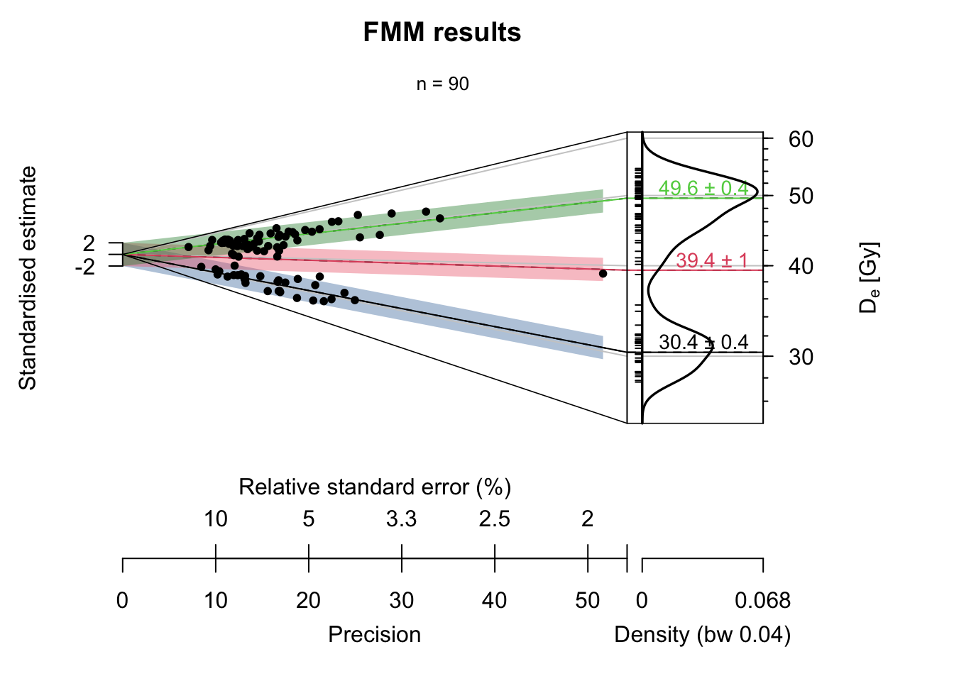
In the following, I first generate the plot and then explain the applied settings below.
Luminescence::plot_AbanicoPlot(
  data = df,
  summary = c("n"),
  rug = TRUE,
  bar = FMM$summary$de,
  bar.col = adjustcolor(
    khroma::color(palette = "bright")(), alpha.f = 0.4),
  polygon = FALSE,
  line = FMM$summary$de,
  line.lab = paste0(
    round(FMM$summary$de,1), " ± ", round(FMM$summary$de_err,1)),
  main = "FMM results")
dataas input, we set thedata.framewith the “measured” valuessummarywill display only the number of observations; therefore, we set itc("n")rugdisplays the small ticks along the vertical; this is not needed but nice to havebarhas as input the identified components, and it will generate the 2-sigma polygonsbar.colsets the colour of the 2-sigma bars. For the colour palette we use the R package khorma by Nicolas Frerebeau because it provides nice colours for colour-blind persons. Theadjustcolor()call is used only to render the colours a little bit transparentpolygonremoves the two standard deviations grey area from the plot, which is unnecessary in our case but would be more like chart junk.lineadds centre lines to each component and connects it with the kernel density part of the Abanico plotline.labadds labels to the components, which we set to the identified component central valuemainsets the title of the plot
The plot can be further modified, but the example above should cover the most relevant plot options.
References
Dietze, M., Kreutzer, S., Burow, C., Fuchs, M. C., Fischer, M., and Schmidt, C.: The abanico plot: visualising chronometric data with individual standard errors, Quaternary Geochronology, 31, 12–18, https://doi.org/10.1016/j.quageo.2015.09.003, 2016.
Galbraith, R. F. and Roberts, R. G.: Statistical aspects of equivalent dose and error calculation and display in OSL dating: An overview and some recommendations, Quaternary Geochronology, 11, 1–27, https://doi.org/10.1016/j.quageo.2012.04.020, 2012.
